Stop Signs Then and Now
The first stop sign made its debut in 1915 in Detroit, Michigan, which was one of the fastest-growing cities due to the booming automotive industry. At the time, roads were chaotic, with little regulation and few traffic rules in place. The original stop sign was far from the familiar red octagon we see today. It was a simple black and white square sign, designed to inform drivers to stop at key intersections. As effective as it was for early traffic control, it lacked the visibility and recognition that would make it a strong safety tool in the growing automobile era.
In 1922, as traffic increased and cars became faster, the need for a more noticeable sign became apparent. The octagonal shape was introduced, setting it apart from other road signs. This eight-sided design was chosen specifically because it could be easily identified even from behind or at odd angles. The shape's uniqueness helped drivers immediately understand that they needed to stop.
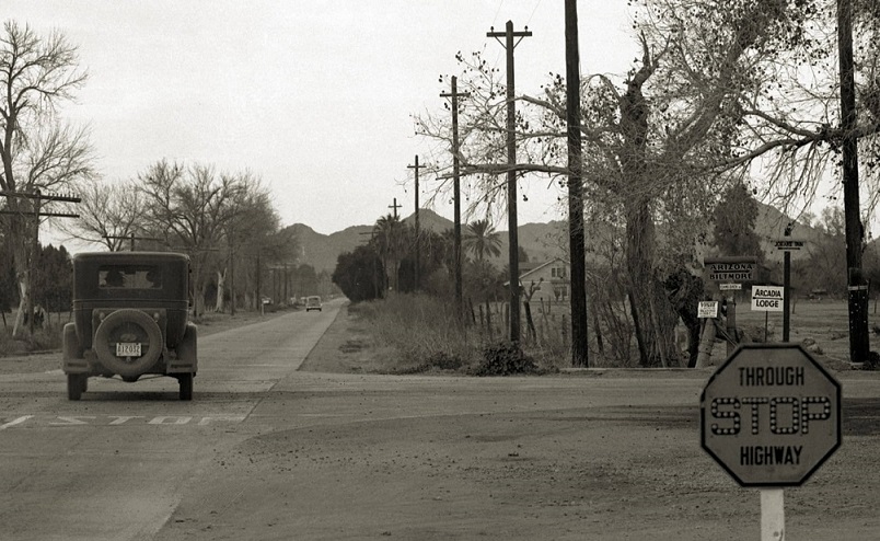
These early stop signs had the right shape but were not the famous red color of our stop signs today. Manufacturers at the time didn’t have durable, fade-resistant materials in red, but they could produce reflective yellow signs that were more visible at night. The yellow color made the sign stand out, but it still wasn’t as attention-grabbing as modern traffic experts desired.
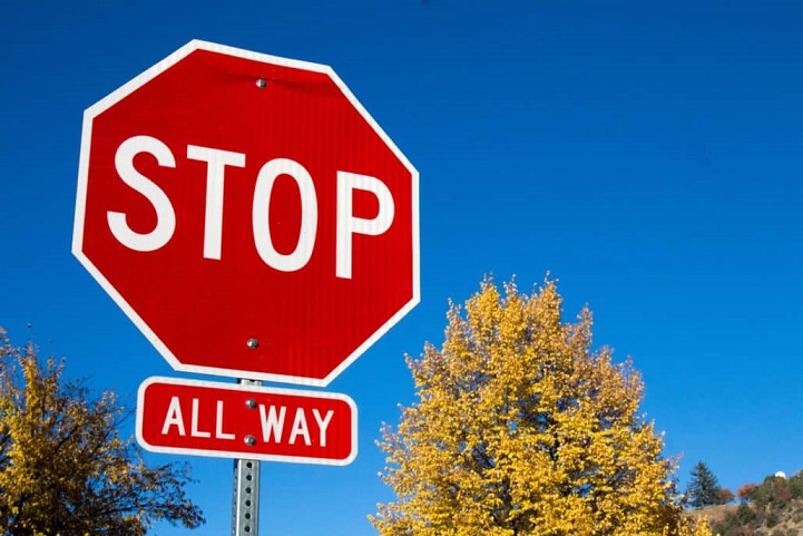
It wasn’t until 1954 that the stop sign was standardized to the red color we know today. By this time, materials had advanced to the point where long-lasting, reflective red coatings were possible. Red was chosen because of its strong association with danger and urgency, making it an ideal choice for a sign that commands drivers to stop. The white lettering on the red background provided high contrast, ensuring that the sign was both bold and easy to read.

The stop sign’s iconic red, octagonal design became a universal standard, not only in the U.S. but around the world. Today, it is one of the most easily recognized traffic symbols globally, and its shape and color serve as an automatic cue for drivers to halt, promoting safer intersections and reducing accidents. The distinctive design ensures that drivers can identify it quickly and act accordingly, making it a simple yet crucial element of road safety today.